






Breaking Down the Look
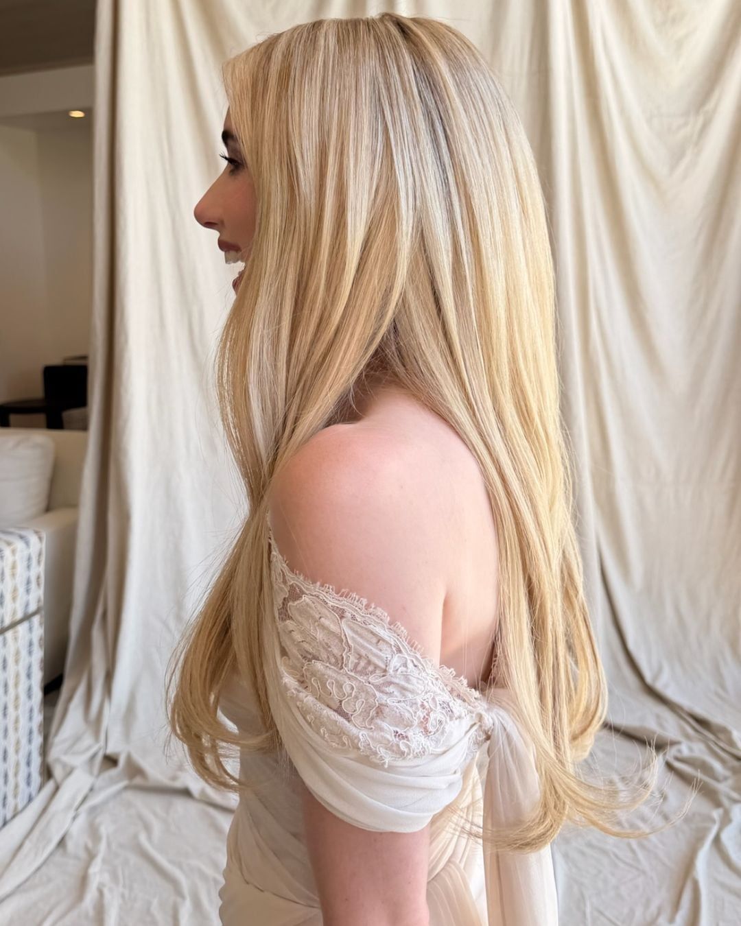
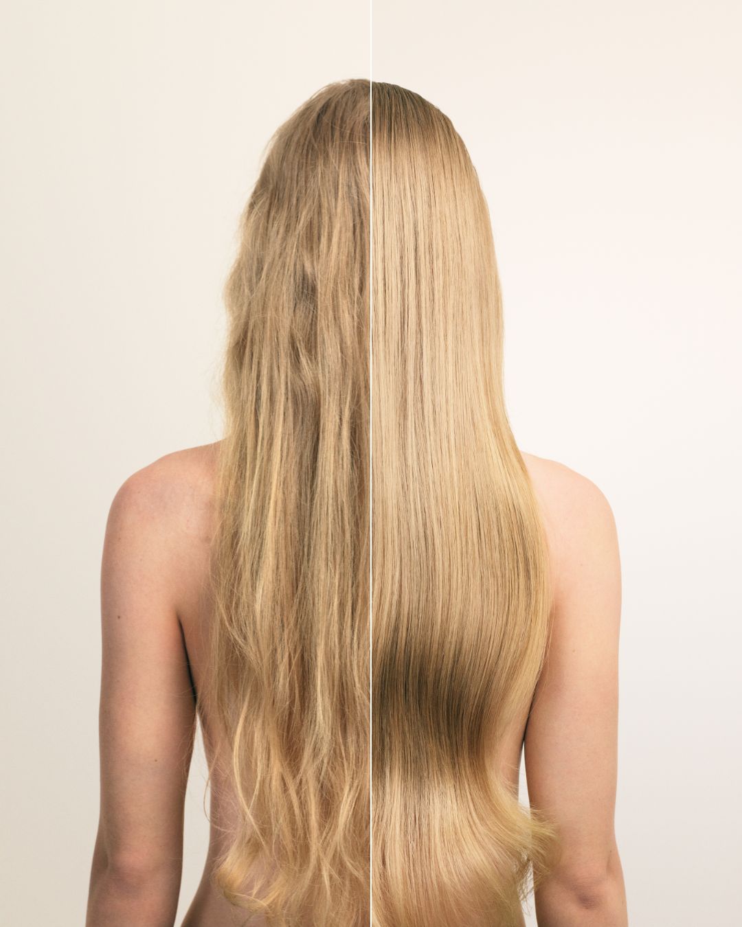
Before you pick up a brush, study the finish. Pranto's signature work tends to live in the space between polished and lived-in — color that reads effortless at first glance but holds serious technical structure underneath. That tension is what makes it worth dissecting.
The mistake most stylists make trying to recreate editorial-style work is chasing the result without mapping the foundation. Start with the base level and tone, then build the dimension on top of it. Trying to shortcut that sequence is why recreations fall flat.
The Color Foundation
If the base isn't right, the dimension won't land. For this look, you're working with a root that has depth — not a flat, single-process depth, but one with enough warmth dialed in to create contrast against the lighter mid-lengths and ends. A root shadow applied with a root-to-mid melt, blended with a damp brush before processing, keeps the transition soft without a hard line of demarcation.